A responsive website reimagined with a thoughtful purpose
Hope B~Lit helps children and women of the world with education and critical basic needs. To help more, they want to not only inspires volunteers and communities to be aware of the organization, but also show highlights and achievements to the potential participants to donate for the organization.
Role
UX Researcher, UX Designer, Branding
Timeline
4 weeks
Skills
Figma, Adobe CC, Maze

The Challenge
Although Hope B~Lit has a lot of accomplishments and is a well-known nonprofit organization, its website is disorganized and is hard to locate information. As a platform to showcase and educate people who might want to get involved into the works, it will be important to effectively present the goals and the projects to the users.
The Goal
Build a responsive NGO website to provide information about the organization and its projects, and promote users to donate, help, and/or volunteer.
My Role
I worked on this project as an UX designer as well as a researcher, working directly with the head of Hope B~Lit. From the stakeholder interview, I was able to gather key wins and opportunities of the existing website, which became a strong foundation of the research process and further design decisions. Since this was a solo project, I was able to perform as a designer, decision maker, and a critical reviewer.


Approach
The project began with a desire to assist a non-profit organization, Hope B~Lit. The founder mentioned during the stakeholder interview that the current website lacked information and content, despite receiving many visitors looking to help. To create a welcoming and straightforward website, research and user studies were conducted, leading to design decisions that were implemented in the final product.
Project Overview
First off, Comprehensive Research to study and learn user preferences and needs is done to make proper design decisions. This is followed by delving into Information Architecture to consider solutions for user problems identified. Then, by visualizing identified solutions and generating design ideas, Interface Design is established. Furthermore, User Testing is conducted to refine and further iterate the designed product.

Research

Comprehensive Research
Stakeholder Interview
Secondary Research
User Interview
Identify the user problems and begin developing solutions.
Process OverviewTo better prepare for the redesign of the website, I conducted a stakeholder interview to discuss, identify, and analyze the problems and opportunities of the current website.
After agreeing that we need a cleaner layout and navigation of information, I proceeded with the secondary research to investigate the standards and the trends of other NGOs and possible opportunities that can be applied to Hope B~Lit, rather than a competitor analysis since NGOs do not compete for profit.
From this, I was able to conduct user interviews with questions catered for Hope B~Lit for an effective outcome.
Findings
Affinity map created to better analyze and categorize research findings.
Persona
Process OverviewUser personas and user journeys are created by identifying patterns from user attitudes, goals, and behaviors. This was done to develop a better understanding of potential users and support design decisions based on the research. A "day in the life" of a persona was also created to aid in understanding user behavior.
Findings

View the additional personas and a day in life of Janet.
Design Decisions

from User Research
Showcase different ways to help for users in clear categories.
Offer good amount of visuals for explanation and layout.
A complete breakdown of the organization’s purpose; what it helps, how it helps, and why it helps in concise, clear format.
Information Architecture

Sitemap
Identify the user problems and begin developing solutions.
Process OverviewSitemap is a visual tool to show the relationship between the selected content and categories, and to foresee users’ flow and understanding of how information is structured. The layout of the content included was selected by user research and design decisions to efficiently deliver information to users.
Findings
Click to view in detail.
Task Flow
Process OverviewBased on user research insights, a task flow was created to determine and anticipate how users will navigate through the website to complete a task. There were two main tasks (also main purposes of the website) determined for the task flow so I can verify if the content is well thought-out for the flow.
Findings
Click to view in detail.
Interface Design

Wireframe
Visualize identified solutions and generate design ideas.
Process OverviewTo explore feasibility on desktop experience (before the mobile screens), and to arrange elements to accomplish the purpose of a website, a visual guide to represent the framework of a website is created. This way, I was able to dissolve the research findings into the wireframe.
Findings
Click to view in detail.
Style Guide
Process OverviewBy creating the mood and tone from a mood board and design decisions to set the tone effectively and to deliver the message visually, a comprehensive guide of the style and aesthetics for the brand was created. This affects not only the UI of the website, but also the information architecture along with the content layout.
Findings


Prototype
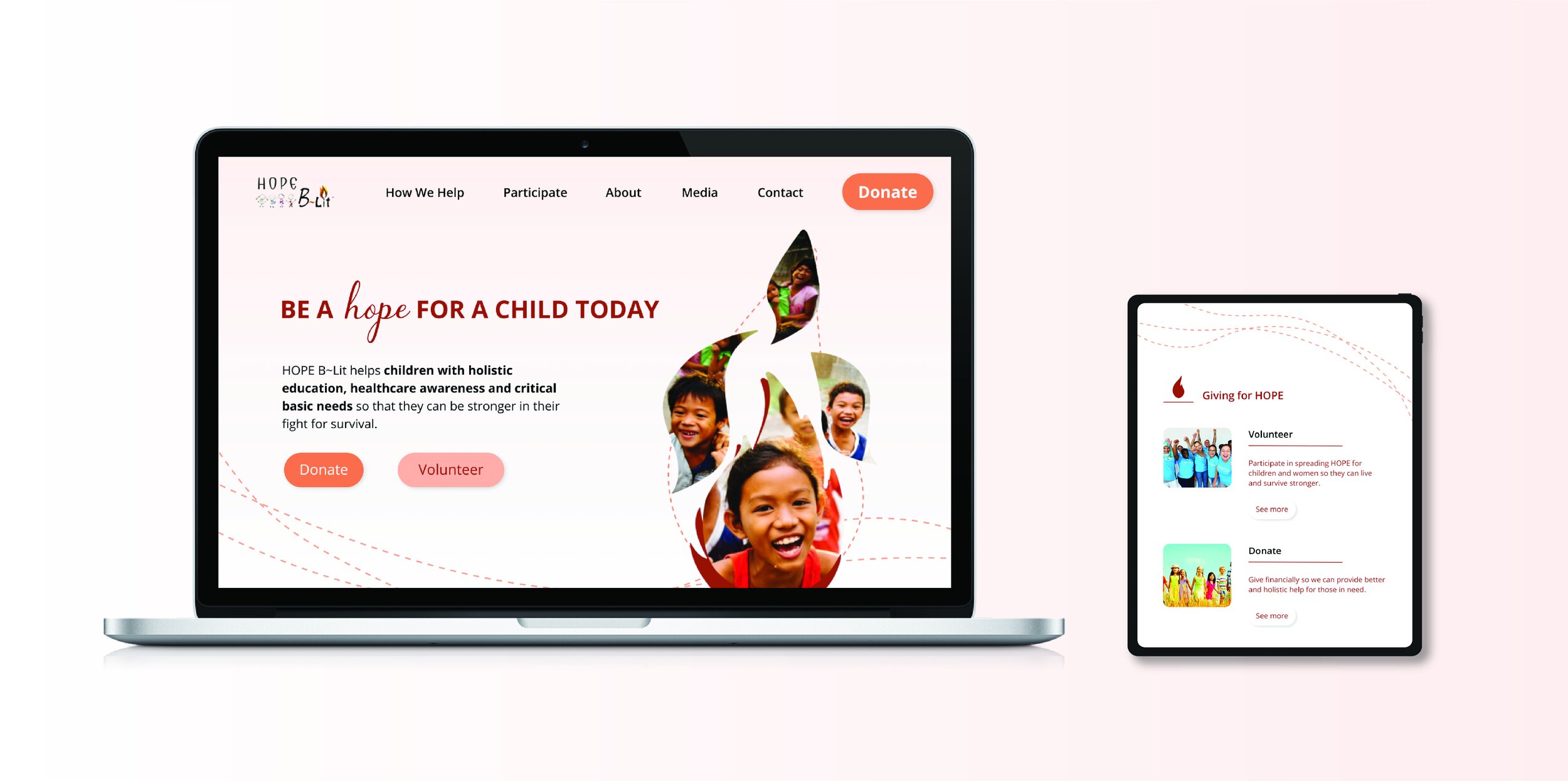
Process OverviewHope B~Lit prototype was developed with a responsive UI design using the style guide and the task flow, to test the screens out for usability, and to visualize the product from research and analysis. Colors were chosen to provide warm, inviting, and comfortable feeling toward the users and the UI elements were thoughtfully selected to offer more engaging screen experience.
Findings
Click to view in detail.
Test

Usability Test
Refine the achieved product and obtain insight to revise.
Process OverviewBy conducting both in-person and remote usability test on individuals with high-fidelity prototype, I was able to identify positive wins and opportunities, and to improve prototype by resolving problems. The test participants were 18 in total, age from 25-60 to cover variety of age spectrum that most actively help NGOs. Without technical difficulties of the testing medium, the success rate to complete given tasks were 100%.
FindingsWins
Brand message and overall aesthetics are well received by all.
Information is straight-forward, easy to understand and locate.
Simple layout is very helpful in understanding the information about the NGO and its work.
Donation process is very easy to go through, with helpful information.
Opportunities
There seems to be too much white space in between content.
Main CTAs can be more consistent to avoid possible confusion.
Homepage and Donation page can be more concise. Especially for the donation page, information can be better layed out so the page directly leads to donation among other content.
Design Decisions

from Usability Test
CTAs need to be revised to provide more consistency and to avoid confusion.
Consider adding different UI elements to fill in white space to make the pages more engaging.
Donation page and its layout can be rearranged and become more concise so that it’s more direct and straight-forward.
View affinity map that sorts, prioritizes, and ranks user testing feedback.
Iteration
Process OverviewBy referring to affinity map to prioritize and reflect user feedback, the initial prototype was revised for better usability. The website now is more concise yet engaging due to rearrangement of certain content and is visually fuller with added UI elements that contribute to the overall usability.
Findings
Add, revise and rearrange content
From the clear feedbacks on the arrangement of the content, I added visual UI elements to make the page more engaging and filled. Also, directional elements were revised so that they can be more congruent with one another.

Donation page reorganized
Since the donation page is one of the key pages that users visit for, a detailed feedback was asked and provided for a better usability. Along with additional UI elements filling the space, the CTA became more engaging with additional effects and the donation window has moved to the top, where the users expect it to be, followed by the information regarding the donation.
Iteration

Reflection
Working with a client always adds a lot of depth to the project for their insight and direction toward the product. Though this started as a passion project (to help an organization with my creativity), I learned a lot, especially how to interact and gain information needed from users for the project. That is why every comment and feedback along the way was helpful to result in a successful outcome. Redesigning an existing website is a process that requires a kin eye for detail and insight. This project allowed me to provide to a client and her users a complete different visual approach from what Hope B~Lit had, in order to not only keep but also enrich what’s already been done and layed out. A few highlights of what was gained from this project include: 1. conducting solid interviews (stakeholder and users) to analyzed acquired insights and cultivate them to design decisions 2. visually portraying and delivering the message and the purpose of the organization with a handful of information.