A sleep tracking app refreshed
with a helpful feature
Napbot tracks and analyzes your sleeping habits with Apple Watch and provides detailed sleep analysis on iPhone. With the sleep analysis that Napbot already provides, the focus of this project is to add a feature for users to utilize this app better by offering further guidance to better sleep and an explanation of their sleep results.
Skills
Figma, Adobe CC, Maze
Role
UX Researcher, UX Designer
Timeline
3 weeks

The Challenge
Though Napbot offers a variety of features that can track and help you understand your sleep cycles and habits, it does not entirely provide detailed information about what you can do to better your specific sleep style according to your sleep results. With a simple analysis on factual data of your sleep, it doesn’t further explain nor offer how users can utilize that data.
The Goal
With the sleep analysis that Napbot already provides, the focus of this project is to add a feature for users to utilize this app better by offering further guidance to better sleep and an explanation of their sleep results.
My Role
Working as a user researcher to establish a strong foundation of user base and problems, then as a UX designer to elevate user experience on an existing product.


Approach
Don’t we all want to be well rested? I’m sure we all have thought about it. The popularity of sleep tracking apps has increased with the rise of mobile apps and wearable devices. These apps provide detailed information on users' sleep patterns, allowing users to improve their sleep. However, many sleep tracking apps provide lengthy and complex data that can be difficult for users to interpret. I aimed to provide a simple and straightforward feature that offers users guidance on how to improve their sleep according to their sleep patterns, without the need for scientific research.
Project Overview
The process of designing a sleep tracking app involves conducting detailed secondary and competitor research to understand the existing apps' features and user reviews and interviews to identify opportunities. Information architecture is used to develop a constructive solution based on the user data collected, followed by interface design to visualize the identified solutions and generate design ideas. User testing is then conducted to refine and iterate the designed product.

Research

Comprehensive Research
Competitor Analysis
Secondary Research
User Interview
Identify the user problems and begin developing solutions.
Process OverviewI narrowed down the top sleep tracking apps that can be used with wearable devices to understand the competitors' strengths and weaknesses. This helped in creating a visual representation of Napbot's position in the market. I then directed the research to find a gap in the market to identify relevant opportunities.
Findings
Find the full competitor analysis here.
User Interview

With this knowledge and analysis, user interviews are conducted to learn what is helpful when using sleep tracking apps, and to investigate users’ experience with their testimonies.
Interviewees who use sleep related apps regularly
who sometimes use the apps
who never used sleep-related apps but are interested
Apple Watch users
Goals
confirm distinctive user problems
generate possible solutions from adding a feature to an existing product
Find the full user interview here.
Persona
Process OverviewFrom user research findings and insight, certain user patterns and problems were detected. By clarifying distinction between user types and to focus the narrative for Napbot’s solution, a persona is developed. From this, we can understand and concentrate on a specific user type and construct a design decision for this user type.
Findings
Research Findings
Affinity Map - Usability
Affinity Map - User Emotion
Process OverviewComprehensive researches and user interviews were completed to acknowledge user patterns, problems, and opportunities to enhance user experience, ultimately by adding a feature. To comprehensively and efficiently analyze and view these findings, I created affinity maps to see what was discovered in a simple way. There is two affinity maps from user research - one focused on usability impact, and another focused on emotional reach on users.
Findings

Please note that this is a partial findings from the map. Find the full affinity map on emotional research on users here.
Design Decisions
from User Research
Add a feature which provide actionable data (suggestions) that is easy to understand and act upon, from what is already presented.
To avoid information cluster, offer fun and engaging UI elements for data introduction.
Good balance between simple information and insights based on sleep tracking results.
Information Architecture

Task Flow
Identify the user problems and begin developing solutions.
Process OverviewNapbot App has a specific purpose and task for its users. Design decisions from the research phase are taken into consideration to determine user flow with the new feature introduced in the app, without disrupting the current setting. The goal is to help users navigate through the app to complete their task based on where they are in the app.
Two main pages, which are Sleep Calendar and Sleep Trend, are drawn here to verify if the additional feature is well thought-out for the flow.
Findings

Sitemap
Process OverviewSitemap, a diagram that shows hierarchy within an app, is created in this stage of the project to prioritize and label features and their relationship. This step prioritizes selected content and categories, and determines the flow between them, including the new feature added to the app. The layout of the content was chosen based on user research and design decisions to efficiently deliver information to users.
Findings
Click to view in detail.
Interface Design

Wireframe
Visualize identified solutions and generate design ideas.
Process OverviewIt’s finally time to contextualize the design decisions and sitemap to an actual mobile experience. This visualization allows to arrange content purposefully and verify if user insight from researches are reflected to the design.
The new features 👇
detailed sleep calendar with sleep patterns
sleep suggestions based on user sleep data, are placed with existing features so that not only it does not interfere, but it enhances the elements of the app
Findings
Click to view in detail.
Test

Usability Test
Wireframe Prototype
Refine the achieved product and obtain insight to revise.
Process OverviewTo ensure the new feature is beneficial and user-friendly, a usability test was conducted with a wireframe prototype. Napbot is already an established and widely used app, with core functionality and usability that are verified. The usability test identified additional opportunities to further improve the feature before moving on to prototyping with UI design.
FindingsWins
“Suggestions” enhance the existing features and work hand in hand.
Information layout is simple and easy to navigate.
Opportunities
Make sure all indications and icons are well visible and appropriate per purpose.
Checklist feature can also be in the calendar view so it can be a good reminder when going through your daily analysis.
Change the wording of the suggestions to more neutral tone.
Design Decisions

from Usability Test on Wireframe
Directional icons and new information can be more visually prominent, with additional colors and elements in the future design.
Carefully select the tone of the advices given, so it isn’t over-friendly or patronizing.
On new Calendar view, integrate and include a checklist for users to access better, in two different locations within the app.
View affinity map that sorts, prioritizes, and ranks user testing feedback.
Iteration
Process OverviewClear direction and focus for improving the wireframe has been confirmed. Needless to say, following iterations were especially focused on improving the users’ interaction with the given data. Though the previous features were already satisfying the users, added features elevate users’ experience within the app and offer more reasons to continue using.
Findings
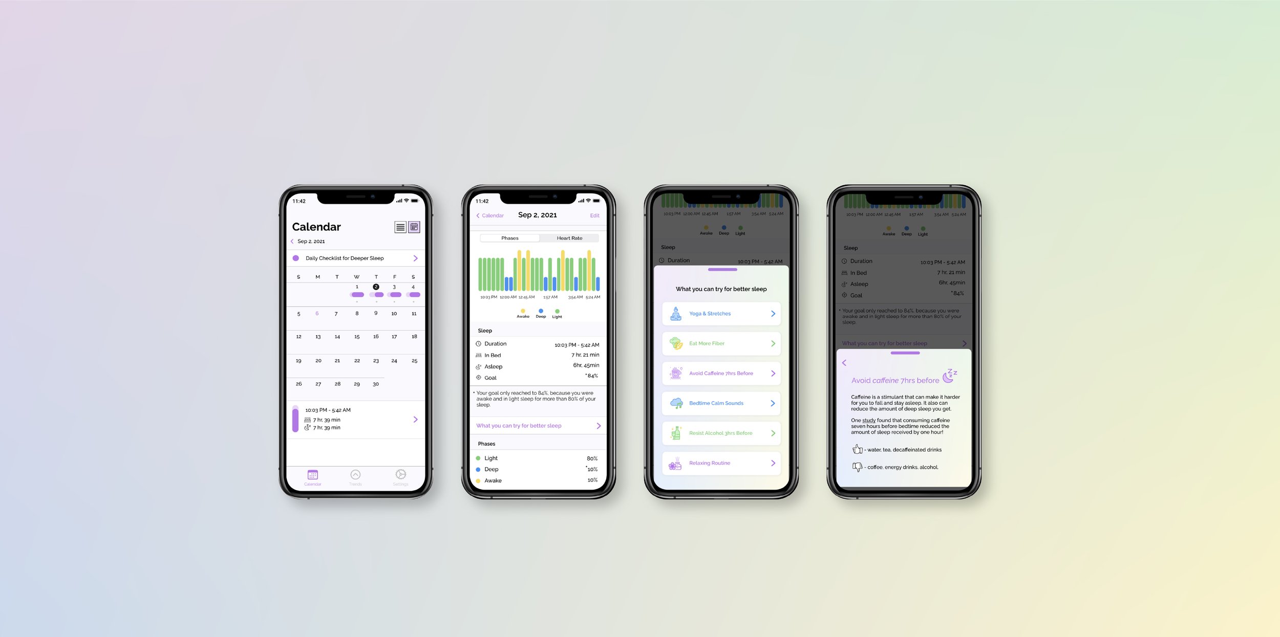
This feature, placed right after a daily sleep analysis, is a clear and concise list of what users can try to better their sleep. This is especially helpful since the list is based on the result of user’s sleep and caters to user's sleep pattern. From the wireframe, potential users stated that more visual elements should be integrated and be prominent so that the content is more engaging. With the iteration, soft background is added with big buttons with illustrative icons.

Same as previous, this new feature offers a daily to-do list for users to check for a better sleep. Testing results pointed out that icons used on the wireframe are slightly misleading and not very eye-catching. Also, some stated that the tone of the suggestions are unnecessarily patronising. As a result, the iterated version, with the soft background as the previous page, the tone has become more neutral.
Most importantly, another feature was newly added from user feedback. This checklist was only visible under daily sleep data. But after receiving the usability testing feedback, I decided to also showcase this list on the calendar overview, so users can check this list even without going into the sleep data, making this feature more accessible.

If users decide to add the checklist to the calendar overview, then it will appear on top of the calendar to encourage users to strive for better sleep, without explaining scientific data and lengthy articles.
UI Design
Process OverviewThe Napbot 2.0 prototype was created after revising the wireframe based on user feedback and additional research. The new features were designed to integrate with the existing UI design, while also improving upon the previous version. The addition of a color background and pleasing icons further enhance the design.
Findings
Iteration

Reflection
Is more the better? or as the great Dieter Rams once said, less is better? A constant, repeated question for designers.
Adding a feature to a successful app isn’t really a smooth task. Only a comprehensive understanding of the previously designed product and detailed research result in thoughtful ideas that can be beneficial to the existing app. This project allowed me to view a specific task (tracking your sleep with electronic device) with many perspectives, which I think is the beauty of UX design. Sleep tracking apps are greatly helpful for those who are curious about their sleep habits, those who want to improve their sleep by learning their own sleep data. For many, simply looking at facts and analysis may be sufficient. But by going one step further and providing actionable data and suggestions from factual data, a user’s enthusiasm to learn about their sleep habits can extend, be fulfilled and lead to even better result than what they first anticipated for. Though adding a feature to an existing app can be tricky, it can be more impactful than any other.
So in this case, slightly more can be better.